Introduction
Sometimes, we may get the requirement to set Gradient Color for Layout or page. In this article, we can learn how we can set a Gradient Color for Layout or Page using CustomRenderer.
Requirements
- This article source code is prepared by using Visual Studio. And it is better to install the latest Visual Studio updates from here.
- This article is prepared on a MAC machine.
- This sample project is Xamarin.Forms PCL project.
- This sample app is targeted for Android, iOS. And tested for Android & iOS.
Description
The creation of a Xamarin.Forms project is very simple in Visual Studio for Mac. It will create three projects:
- Shared Code
- Xamarin.Android
- Xamarin.iOS
The Mac system with Visual Studio for Mac doesn't support Windows projects (UWP, Windows, Windows Phone)
The following steps will show you how to create Xamarin.Forms projects in a Mac system with Visual Studio.
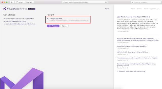
First, open Visual Studio for Mac. And click on New Project.

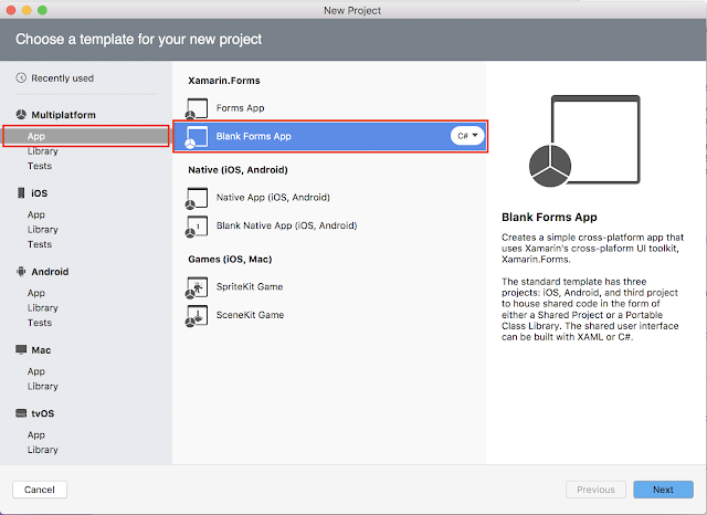
After that, we need to select whether you're doing Xamarin.Forms or Xamarin.Android or Xamarin.iOS project. If we want to create Xamarin.Forms project just follow the below screenshot.

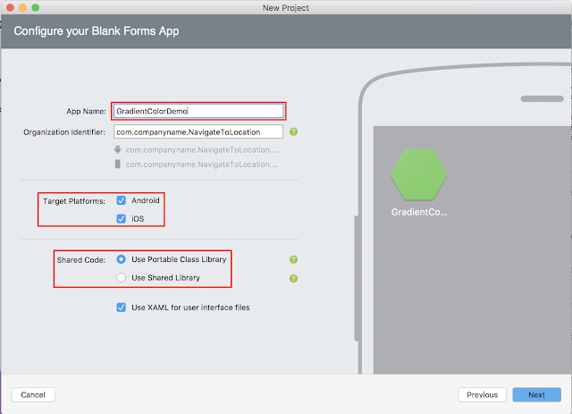
Then, we have to give the app name; i.e., GradientColorDemo.

Note
In the above screen under Shared Code, select Portable class Library or Use Shared Library.
In the above screen under Shared Code, select Portable class Library or Use Shared Library.
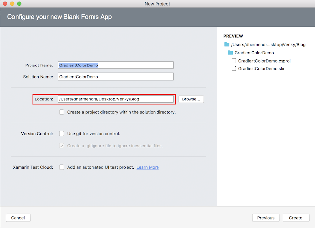
Then, click on Next Button and the following screenshot will be displayed. In that screen, we have to browse the file path where we want to save that application on our PC.

After clicking on the create button it will create the RoundedCornerViewDemo Xamarin.Forms project like below.

And the project structure will be:
- GradientColorDemo: It is for Shared Code
- GradientColorDemo.Droid: It is for Android.
- GradientColorDemo.iOS: It is for iOS

We need to follow the below steps to set Gradient Color for StackLayout.
Portable Class Library (PCL)
Step 1:
In PCL, create a class name GradientColorStack inside the CustomControls folder and which should inherit from StackLayout like below.
GradientColorStack.cs- using Xamarin.Forms;
- namespace GradientColorDemo.CustomControls
- {
- public class GradientColorStack : StackLayout
- {
- public Color StartColor { get; set; }
- public Color EndColor { get; set; }
- }
- }
Step 2:
Create your own Xaml page named GradientColorPage.xaml, and make sure to refer to "GradientColorStack" class in Xaml by declaring a namespace for its location and using the namespace prefix on the control element. The following code example shows how the "GradientColorStack" renderer class can be consumed by a XAML page:
- <?xml version="1.0" encoding="utf-8"?>
- <ContentPage xmlns="http://xamarin.com/schemas/2014/forms"
- xmlns:x="http://schemas.microsoft.com/winfx/2009/xaml"
- xmlns:local="clr-namespace:GradientColorDemo.CustomControls; assembly:GradientColorDemo"
- x:Class="GradientColorDemo.Views.GradientColorPage">
- <Grid VerticalOptions="FillAndExpand" RowSpacing="0">
- <Grid.RowDefinitions>
- <RowDefinition Height="*"/>
- <RowDefinition Height="*"/>
- </Grid.RowDefinitions>
- <Grid Grid.Row="0" BackgroundColor="#3e5151">
- <StackLayout VerticalOptions="Center">
- <Label Text="Normal color for StackLayout" HorizontalTextAlignment="Center" VerticalTextAlignment="Center" TextColor="White"/>
- </StackLayout>
- </Grid>
- <Grid Grid.Row="1">
- <local:GradientColorStack StartColor="#3e5151" EndColor="#decba4">
- <StackLayout VerticalOptions="CenterAndExpand">
- <Label Text="Horizontal Gradient color for StackLayout" HorizontalTextAlignment="Center" VerticalTextAlignment="Center" TextColor="White"/>
- </StackLayout>
- </local:GradientColorStack>
- </Grid>
- </Grid>
- </ContentPage>
Note:
The "local" namespace prefix can be named anything. However, the clr-namespace and assembly values must match the details of the custom renderer class. Once the namespace is declared the prefix is used to reference the custom control.
- using Xamarin.Forms;
- namespace GradientColorDemo.Views
- {
- public partial class GradientColorPage : ContentPage
- {
- public GradientColorPage()
- {
- InitializeComponent();
- }
- }
- }
Xamarin.Android:
In Android project, create a class with GradientColorStackRenderer name inside the CustomControls folder:
GradientColorStackRenderer.cs
- using System;
- using GradientColorDemo.Droid;
- using GradientColorDemo.CustomControls;
- using Xamarin.Forms;
- using Xamarin.Forms.Platform.Android;
- [assembly: ExportRenderer(typeof(GradientColorStack), typeof(GradientColorStackRenderer))]
- namespace GradientColorDemo.Droid
- {
- public class GradientColorStackRenderer : VisualElementRenderer<StackLayout>
- {
- private Color StartColor { get; set; }
- private Color EndColor { get; set; }
- protected override void DispatchDraw(global::Android.Graphics.Canvas canvas)
- {
- #region for Vertical Gradient
- //var gradient = new Android.Graphics.LinearGradient(0, 0, 0, Height,
- #endregion
- #region for Horizontal Gradient
- var gradient = new Android.Graphics.LinearGradient(0, 0, Width, 0,
- #endregion
- this.StartColor.ToAndroid(),
- this.EndColor.ToAndroid(),
- Android.Graphics.Shader.TileMode.Mirror);
- var paint = new Android.Graphics.Paint()
- {
- Dither = true,
- };
- paint.SetShader(gradient);
- canvas.DrawPaint(paint);
- base.DispatchDraw(canvas);
- }
- protected override void OnElementChanged(ElementChangedEventArgs<StackLayout> e)
- {
- base.OnElementChanged(e);
- if (e.OldElement != null || Element == null)
- {
- return;
- }
- try
- {
- var stack = e.NewElement as GradientColorStack;
- this.StartColor = stack.StartColor;
- this.EndColor = stack.EndColor;
- }
- catch (Exception ex)
- {
- System.Diagnostics.Debug.WriteLine(@"ERROR:", ex.Message);
- }
- }
- }
- }
Here OnElementChanged method instantiates an Android UI Layout and in that, I mentioned vertical and horizontal gradients within #region.
In iOS project, create a class with GradientColorStackRenderer name inside the CustomControls folder:
- using CoreAnimation;
- using CoreGraphics;
- using GradientColorDemo.CustomControls;
- using GradientColorDemo.iOS;
- using Xamarin.Forms;
- using Xamarin.Forms.Platform.iOS;
- [assembly: ExportRenderer(typeof(GradientColorStack), typeof(GradientColorStackRenderer))]
- namespace GradientColorDemo.iOS
- {
- public class GradientColorStackRenderer : VisualElementRenderer<StackLayout>
- {
- public override void Draw(CGRect rect)
- {
- base.Draw(rect);
- GradientColorStack stack = (GradientColorStack)this.Element;
- CGColor startColor = stack.StartColor.ToCGColor();
- CGColor endColor = stack.EndColor.ToCGColor();
- #region for Vertical Gradient
- //var gradientLayer = new CAGradientLayer();
- #endregion
- #region for Horizontal Gradient
- var gradientLayer = new CAGradientLayer()
- {
- StartPoint = new CGPoint(0, 0.5),
- EndPoint = new CGPoint(1, 0.5)
- };
- #endregion
- gradientLayer.Frame = rect;
- gradientLayer.Colors = new CGColor[] { startColor, endColor };
- NativeView.Layer.InsertSublayer(gradientLayer, 0);
- }
- }
- }
Here OnElementChanged method instantiates an iOS UI and in that, I mentioned vertical and horizontal gradients within #region.
Output:
Please download the sample from below.


No comments:
Post a Comment